Mortgagee Destroys House: Cardigan-wearing Cimino knew as he set it full-width late in the afternoon, late in January 2009, he would never better that frontpage headline. Believing he’d confused mortgagee for mortgager, the newspaper’s editor was furious—“My friend is a legal executive, and she assures me…”. Cimino gently counselled the incandescent editor to trust her dictionary over her friend.
image Dargaville News
Subeditors: Those cardigan-wearing people who know an awful lot about their very small domain!
Kathryn Ryan
Subeditors have it easy, compared to self-subeditors. Subeditors might toil at the absolute coal face, but they do so with an immense advantage over the author and editor, in that they are reading with a fresh set of eyes. The author–subeditor shoulders all the care and all the responsibility, of implementing the rules of a publication’s style guide.
Style guides exist, primarily, to help achieve consistency throughout a publication. Newspaper style guides, generally, dumb down; other mastheads adhere to positively archaic styles—The New Yorker famously, insists upon the distracting diaeretisationcoined, of course, from diaeresis coöperate, serenely indifferent to a world long since inured to thrall of pronouncing the word coop-erate. Some readers—possibly most—may find the fruits of this style guide distastfully idiosyncratic. The earnest intention, however, is for Light the Fuse to read agreeably as is conscionable, but nor can the opportunity to explore typographic tools to further the cause. Renderings such as cooperate, cooperate, cooperate would demand extensive brain rewiring. Given the unprecedented existential imperative for global cooperation, fuse-lighting—particularly with the considerable heft of WebKit and The New Yorker behind it, doing the latter no small favour into the bargain—could be boosted with a freshly forged soft-hyphenating ligature, oo, invoked by simply typing oO.
Aotearoa/New Zealand Aotearoa is used where practicable when referring to the multi-island nation state of that name. Elsewhere, the official name New Zealand is preferred when the nation’s name is employed as a proper adjective, for example:
Hospitality, pre-neoliberalism, was a proud New Zealand attribute. Sadly, hospitality is currently only valued if it is being comprehensively monetised. As neoliberalism is rendered irrelevant by the Great Mobilisation, it is hoped that New Zealanders will rediscover a wholesome role for hospitality in Aotearoa…
Just one style benefit of using both Aotearoa and New Zealand, but separately, is retaining New Zealander in preference to Aotearoan , Aotearoaian , Aotearoaer , or Kiwi . It should go without saying that using Aotearoa–New Zealand would reek of virtue signalling, and be unrelievedly unstylish and cumbersome. To be continued… Return to text
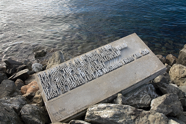
Ragged Rocks: Noeline gave Cimino Glover’s Hot Water Sailor , sparking a 14-year-old’s lifelong fascination with typography. Here, splendid bad-rag art serendipitously illustrates that which pretty paragraph line-length algorithms help iron out.
sculptor Catherine Griffiths
Hyphenation If working as a newspaper subeditor didn’t cure Cimino’s enthusiasm for comprehensive hyphenation, nothing was going to—newspaper style guides proscribe all but the most essential hyphenation. Magazine style-guides, however, tend to allow for more liberal hyphen deployment, and sheep-for-a-lamb Mahurangi Magazine and Light the Fuse take it into the realms of the radical, not least of all in pursuit of typographical perfection. Magazine-style left-justification can leave yawning gaps in the unjustified righthand side of paragraphs. Judiciously deployed soft-under the bonnet, the HTML soft hyphen entity, code: ­hyphenation however, serenely aids the much-needed civilisation of the right. In time, there is no reason online magazines and books cannot exceed the typographical finesse of the icecap-melting printed form, which is blithely airfreighted globally hither and yon. A bold step in this direction is the leadership shown by builders of the open-source browser engine WebKit. If early-championer Safari succeeds in leading behemothian Chrome, and Edge, Firefox et al into universal deployment of the whimsically named cssCascading Style Sheets, developed by the World Wide Web Consortium property text-wrap: pretty , masterfully balanced, soft-hyphened paragraphs will abound, and diminish the appetite for expensive glossies and hardbacks, and with their eye-wateringparticularly if one has a fig to give for the icecaps delivery charges.
Notwithstanding the above, line-end hyphenation is only resorted to where the raggedness can’t better be addressed by improving the text around it… To be continued… Return to text
Punctuation As with hyphenation, newspaper style guides urge a minimalist approach to punctuation, some large-circulation publications going so far as stipulating single quotes in lieu of single and double typogprettyraphic quotes. Probably needless to sayin all likelihood, in respect to even the occasional Mahurangi Magazine reader, this publication takes a punctuate-and-be-damned approach—in return, it welcomes reader’s lovingly suggested corrections and improvements. A far-from rare criticismthank you sincerely Mike of Cimino’s writing is the sentiment that are too many commas and not enough periods. Because a policy of continual improvement is practiced, the ratio does trend towards the reader-friendly—early readers, in effect, leaving the sheep tracks progressively easier to follow. Commas, periods, em- and en-dashes, and myriad other punctuation marks, are given their own headings. Return to text
Disclosure The author of this novel modello is no longer the secretary of Mahurangi Action Incorporated or the Mahurangi Coastal Path Trust. The content published here, however,is that of the editorially independent, independently funded Mahurangi Magazine.